Showing posts with label data visualisation. Show all posts
Showing posts with label data visualisation. Show all posts
Thursday
Monday
57 Interesting World Maps
I came across this page called '57 maps that will challenge what you thought you knew about the world' on StumbleUpon.
There are some really interesting, as well as some really funny, map data visualisations that are worth checking out.
I've included some of my favourites below but it's really worth having a look at the page as they are all pretty good.


There are some really interesting, as well as some really funny, map data visualisations that are worth checking out.
I've included some of my favourites below but it's really worth having a look at the page as they are all pretty good.
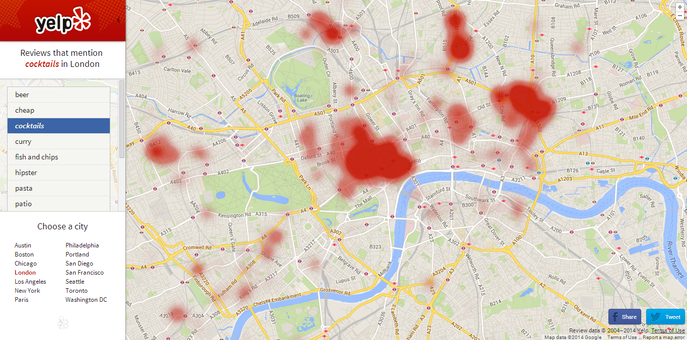
I also found this Yelp Worldmap which is a heat map showing the hipster density in New York which I found quite funny.
The map works by using data from reviews, so when calculating hipster density Yelp will have used reviews that mention the word 'hipster' and gone from there, pretty clever.
You can customise a map to see certain things, picking a city and then a thing that you'd like to see the density of in that city.
I chose London as my city and cocktails as my thing to see.
As well as being quite amusing and fun to play around with, Yelp Worldmap could actually be a pretty useful thing to use if you're looking for a certain thing and are not sure where to go.
Friday
Venngage
I've recently discovered this site called Venngage that lets you create your own data visualisations and graphs, either by using an already made template or by starting completely from scratch and making your own thing.
I decided to use my Brighton restaurant data from Tripadvisor and made a page of data visualisations from scratch.
I don't think I'm able to embed the html of the page in this post but you can access it HERE.
I've included a screen grab of the graph so you can see what it looks like but without the interactive part which is quite important to the understanding of the data.
The pie chart is interactive; when you hover over each coloured slice it tells you what type of cuisine it is representing and how many restaurants of that cuisine there are in Brighton.
The '£' bubbles represent the different price brackets in relation to Brighton restaurants, and what percentage of restaurants fall under each price bracket. So, for example, most restaurants in Brighton are moderately cheap (represented by '££') and very expensive restaurants come in second (represented by '££££').
At the bottom of the page I've made a wordcloud consisting of the most popular dining options available for Brighton restaurants.
Please click on the link, or the first image, to be taken to the real graph so you can get a proper feel of it.
Thursday
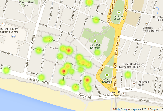
Heatmap of Tripadvisor's Most Visited Restaurants
Unfortunately Google Fusion doesn't let you publish heatmaps for geocoded addresses, so instead I've taken screenshots of the effect, which you can see below.
The redder the heatspot, the more people have visited the place and left reviews on Tripadvisor.


The redder the heatspot, the more people have visited the place and left reviews on Tripadvisor.
It's cool how the further you zoom out, the more the heatspots blur into one...
Wednesday
Different proportion of cuisines in Brighton
Here I've made my own Data Visualisation graph, showing the proportion of all of the different cuisines in Brighton. I've got my data from Trip Advisor, so am relying on that for the accuracy of my data.
As you can see, apparently the cuisine with the most restaurants in Brighton is British cuisine, which is probably including pubs as there are a lot of pubs in Brighton!
As you can see, apparently the cuisine with the most restaurants in Brighton is British cuisine, which is probably including pubs as there are a lot of pubs in Brighton!
Further Data Visualisation Example
The data visualisation below is a slight variation of the graph below.
It is using the same data - cocktail recipes - but displaying that data in a different form, that some people may or may not prefer.
I personally prefer the data visualisation in the previous post as I think it's more interesting to look at, but there are many different options with which to display data on Raw.

Data Visualisation
This week I've been looking into the world of data visualisation.
Data visualisation is, as the name suggests, the digital visualisation of data, and is a way to represent data clearly and effectively (often in a creative way).
A website I've been looking at that has lots of interesting examples of different forms of data visualisation is Visual Complexity, which has examples ranging from things such as maps of locations on Foursquare to visual overviews of music albums (I've still no clue how that works but it does!)
I find these examples of Visual Complexity really fascinating but at the moment have no idea how to go about making my own so need to really look into it!
There are some other good sites like We Love Datavis, which is a Tumblr site, that give further examples of what people have done, so I'm going to have more of a look and investigate this data visualisation business...
Data visualisation is, as the name suggests, the digital visualisation of data, and is a way to represent data clearly and effectively (often in a creative way).
A website I've been looking at that has lots of interesting examples of different forms of data visualisation is Visual Complexity, which has examples ranging from things such as maps of locations on Foursquare to visual overviews of music albums (I've still no clue how that works but it does!)
 |
| Graph using locative devices - Visual Complexity |
 |
| Graph visualising band Dead Kennedys' five studio albums - Visual Complexity |
I find these examples of Visual Complexity really fascinating but at the moment have no idea how to go about making my own so need to really look into it!
There are some other good sites like We Love Datavis, which is a Tumblr site, that give further examples of what people have done, so I'm going to have more of a look and investigate this data visualisation business...
Subscribe to:
Posts (Atom)