Thursday
Monday
'On the Road' Reconfigured
While browsing the internet yesterday I stumbled upon another interesting project relating to Google Maps.
'On the Road for 17527 Miles' is a project made by a Berlin college student as part of a college thesis, and could be described as a modern day refiguring of Jack Kerouac's beat generation novel On The Road.
In an e-book, Gregor Weichbrodt has placed a long series of detailed directions from Google Maps, describing the journey that Kerouac takes step-by-step, and organised into four chapters, as in the book.


Click below to read the embedded e-book version...
Zoopla Property Price Maps
I've just come across yet another interesting heatmap as I was browsing property websites, as you do...
This time the heatmap is from Zoopla, the property search website, and shows the different prices of property in different parts of the country, with the highest priced areas being shown in red and the lowest areas in blue.
The heatmap is a collaboration with Google Maps and also shows the average property price for each area. View it properly HERE.
Here are some snapshots...


http://zoop.la/xcKiKV
This time the heatmap is from Zoopla, the property search website, and shows the different prices of property in different parts of the country, with the highest priced areas being shown in red and the lowest areas in blue.
The heatmap is a collaboration with Google Maps and also shows the average property price for each area. View it properly HERE.
Here are some snapshots...
I zoomed in to look more closely at London property prices, which not surprisingly showed up as the most expensive area in the UK.
If you click on each price sticker it gives you a more precise number for the average property price, as well as telling you the name of the area.
http://zoop.la/xcKiKV
57 Interesting World Maps
I came across this page called '57 maps that will challenge what you thought you knew about the world' on StumbleUpon.
There are some really interesting, as well as some really funny, map data visualisations that are worth checking out.
I've included some of my favourites below but it's really worth having a look at the page as they are all pretty good.


There are some really interesting, as well as some really funny, map data visualisations that are worth checking out.
I've included some of my favourites below but it's really worth having a look at the page as they are all pretty good.
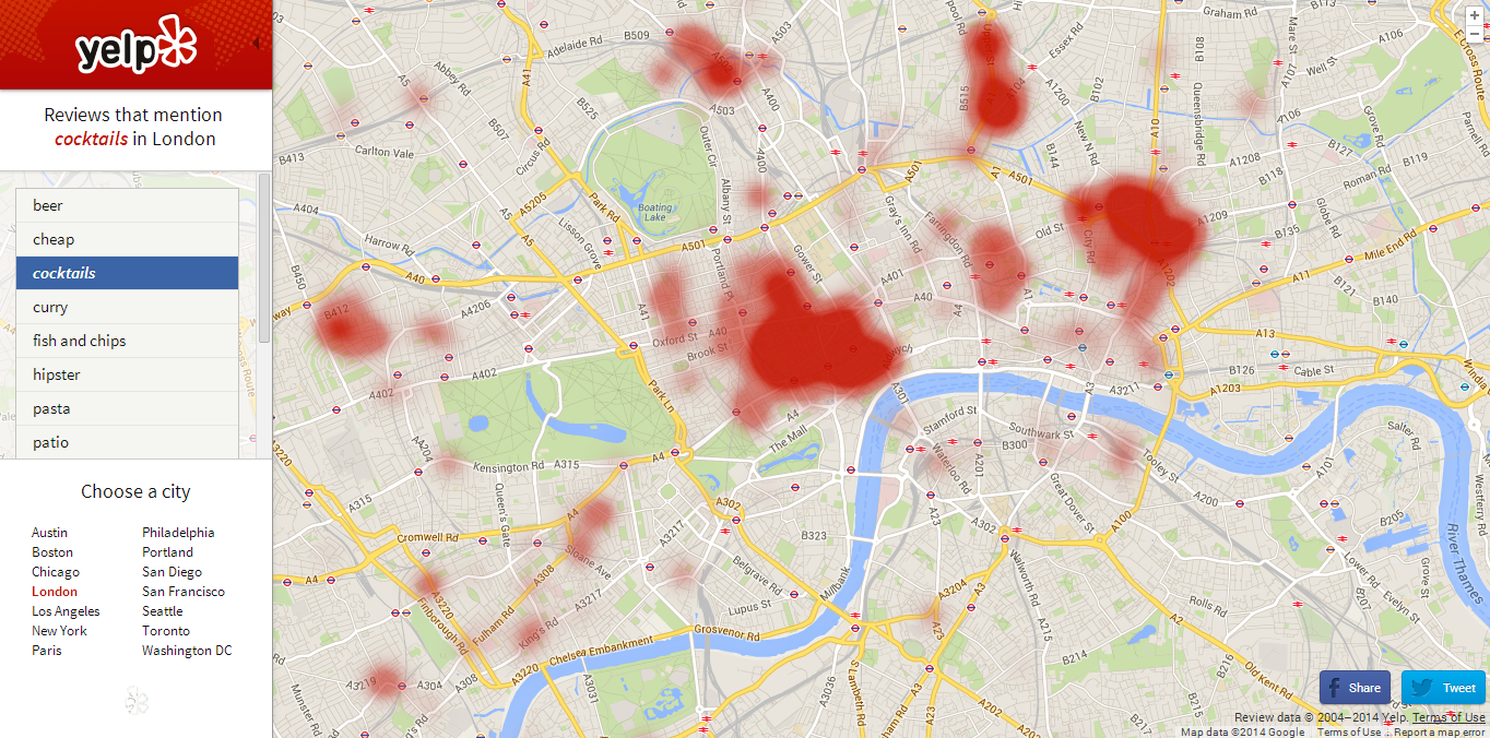
I also found this Yelp Worldmap which is a heat map showing the hipster density in New York which I found quite funny.
The map works by using data from reviews, so when calculating hipster density Yelp will have used reviews that mention the word 'hipster' and gone from there, pretty clever.
You can customise a map to see certain things, picking a city and then a thing that you'd like to see the density of in that city.
I chose London as my city and cocktails as my thing to see.
As well as being quite amusing and fun to play around with, Yelp Worldmap could actually be a pretty useful thing to use if you're looking for a certain thing and are not sure where to go.
More Google Street View Glitches
I was looking at the offices where I'm going to be doing my work placement next term on Google Street View and came across yet more amusing glitches.
I've got a three week work placement at the media agency Mindshare in London which I'm really excited about; they have a cool new office in the Central St Giles complex just off Tottenham Court Road, sharing the building with Google's offices which is quite exciting.
First of all, it seems that everyone had prepared for the Google Street View car to come round, those people dressed up are possibly Google employee's from the building, which would explain how they knew about the car coming.
I found it quite amusing that one guy had made himself a Google place marker sign to hold. When I first saw it I thought it was a real one and was very confused!
What's going on here?!
I didn't know that certain people's places had to be blurred out on Street View, or perhaps it's another glitch.
The effect is especially weird in the image below, with people's heads being all normal but then something strange happening to their bodies and legs...
Friday
Venngage
I've recently discovered this site called Venngage that lets you create your own data visualisations and graphs, either by using an already made template or by starting completely from scratch and making your own thing.
I decided to use my Brighton restaurant data from Tripadvisor and made a page of data visualisations from scratch.
I don't think I'm able to embed the html of the page in this post but you can access it HERE.
I've included a screen grab of the graph so you can see what it looks like but without the interactive part which is quite important to the understanding of the data.
The pie chart is interactive; when you hover over each coloured slice it tells you what type of cuisine it is representing and how many restaurants of that cuisine there are in Brighton.
The '£' bubbles represent the different price brackets in relation to Brighton restaurants, and what percentage of restaurants fall under each price bracket. So, for example, most restaurants in Brighton are moderately cheap (represented by '££') and very expensive restaurants come in second (represented by '££££').
At the bottom of the page I've made a wordcloud consisting of the most popular dining options available for Brighton restaurants.
Please click on the link, or the first image, to be taken to the real graph so you can get a proper feel of it.
Subscribe to:
Comments (Atom)